 By
By As mobile devices continue to dominate internet usage, having a mobile-optimized website is no longer just a good practice—it’s essential for SEO success. Mobile SEO is the practice of optimizing your website to rank well in search engines for mobile users. Google’s mobile-first indexing now makes mobile optimization a top priority for SEO professionals. In this guide, we’ll explore essential mobile SEO strategies that will help you improve your website’s performance and increase your rankings in Google’s search results.
Why Mobile SEO is Crucial for 2026
The significance of mobile SEO has grown rapidly, and it shows no signs of slowing down. In 2026, mobile search is predicted to make up the majority of online traffic globally. Here’s why it’s crucial:
- Mobile-First Indexing: Google now indexes and ranks your site based on its mobile version. If your mobile site isn’t up to par, your rankings can drop significantly.
- User Experience Matters: Mobile devices come with smaller screens, slower internet speeds, and different usage patterns. Optimizing for mobile ensures a seamless experience, which in turn improves engagement and retention.
- Local Search Trends: Mobile users often search for local businesses, products, and services. A well-optimized mobile site increases your visibility on local search results.
With these changes, it’s clear that focusing on mobile SEO strategies is critical for any website aiming to remain competitive.
Essential Mobile SEO Strategies
1. Prioritize Mobile Page Load Speed
Speed is crucial for mobile websites. Users on mobile devices expect pages to load quickly. Google has made page speed a ranking factor, and slow-loading pages will not only harm your rankings but also increase your bounce rate.
How to Improve Mobile Page Speed:
- Optimize Images: Compress large images and use formats like WebP for faster loading without sacrificing quality.
- Enable Caching: Caching allows a user’s browser to store files, which helps load your website faster on subsequent visits.
- Minimize JavaScript and CSS: Reduce the size of your JavaScript and CSS files to avoid delays.
- Use a Content Delivery Network (CDN): A CDN stores copies of your site in multiple locations around the world, helping reduce the time it takes for your mobile pages to load.
Tools like Google PageSpeed Insights or GTmetrix can help you analyze your site’s performance and provide specific recommendations for improvement.
2. Implement Responsive Web Design
Responsive design ensures that your website automatically adjusts to fit the screen size of any device, whether it’s a smartphone, tablet, or desktop computer. This is essential for both user experience and SEO because it prevents the need for separate mobile versions of your site.
Benefits of Responsive Design:
- Better User Experience: Users can navigate your site easily on any device, improving engagement and reducing bounce rates.
- Google’s Preferred Design: Google favors responsive websites because they use a single URL, simplifying crawling and indexing. This avoids issues with duplicate content that can occur with separate mobile URLs.
When implementing a responsive design, make sure your text is readable without zooming, buttons are easily clickable, and all images and videos adjust seamlessly to the screen.
3. Focus on Core Web Vitals for Mobile
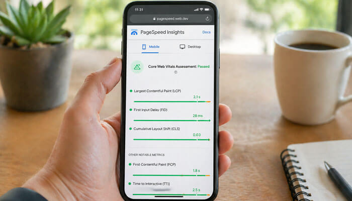
In 2026, Core Web Vitals are a significant ranking factor. These metrics measure how real users experience your website’s performance. Core Web Vitals focus on three main areas that affect mobile users’ experience:
- Largest Contentful Paint (LCP): Measures how long it takes for the largest piece of content (like an image or text block) to load. For mobile sites, aim for an LCP of 2.5 seconds or less.
- First Input Delay (FID): Measures how quickly a page becomes interactive. An ideal FID is under 100 milliseconds.
- Cumulative Layout Shift (CLS): Tracks how much the layout shifts during page load. A CLS score of 0.1 or less is considered good.
Improving Core Web Vitals not only boosts your rankings but also ensures that mobile users have a smooth experience on your site.
4. Optimize for Mobile Local Search
Mobile users often search for local information, like nearby restaurants, stores, or services. Local SEO for mobile is incredibly important, especially with the rise of location-based searches on smartphones.
How to Optimize for Local Mobile SEO:
- Google My Business: Ensure your Google My Business profile is up-to-date with accurate business hours, contact information, and location. This helps you appear in Google’s local pack and map search results.
- Local Keywords: Include location-based keywords on your website, such as “best pizza in [city name]” or “affordable plumbers in [neighborhood].”
- Schema Markup for Local Businesses: Use local business schema markup to help search engines understand your business location and offerings, which improves your chances of appearing in local search results.
5. Avoid Intrusive Interstitials and Pop-Ups
While pop-ups are common for desktop sites, they are particularly intrusive on mobile devices. A full-screen pop-up or interstitial can block content and frustrate users, especially if it’s hard to close on smaller screens.
Google’s guidelines discourage pop-ups that cover content on mobile because they negatively impact user experience. If you must use pop-ups, ensure they are easy to dismiss and do not cover critical content.
Measuring Mobile SEO Success
Once you’ve implemented these mobile SEO strategies, it’s crucial to measure their success. Analytics and tracking tools provide valuable insights into your mobile site’s performance:
- Google Search Console: Check for mobile usability issues and monitor mobile-specific performance in search results.
- Google Analytics: Track mobile traffic, bounce rate, conversion rate, and other key metrics.
- PageSpeed Insights: Regularly check your site’s loading speed and receive specific recommendations for improvements.
By monitoring these key metrics, you can continually optimize your mobile website and stay ahead of competitors.
Conclusion
Mobile SEO is no longer an optional strategy—it’s vital for maintaining visibility and providing an excellent user experience. Prioritizing mobile page load speed, responsive design, Core Web Vitals, local search optimization, and user-friendly navigation will significantly improve your rankings in 2026 and beyond.
By staying proactive with mobile SEO best practices, you’ll not only ensure that your site is mobile-first, but also improve user engagement, conversion rates, and search visibility. Remember that SEO is an ongoing process, so keep testing, optimizing, and adapting to ensure your site remains competitive in an ever-evolving digital landscape.